Projects.

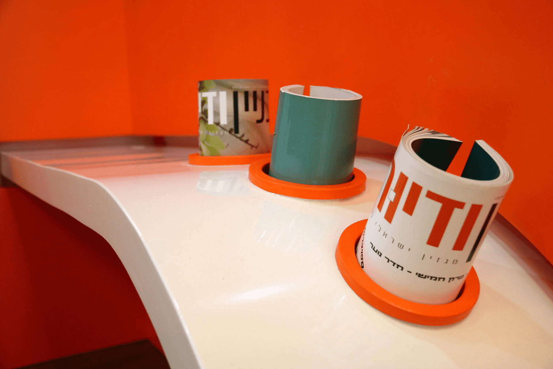
Everything, but EVERYTHING starts from branding! The design of the space needs to be a derivative of the graphic language (kav esteti) or branding of your business. We are experts in taking your businesses graphic language and branding and expressing it in your business space to create something interesting, intriguing and attractive. Branding helps increase the pride your employees take in your business, expresses your businesses uniqueness and more so, gives you, the business owner, a pleasant, comfortable and ergonomic space in which you spend a significant part of the day. Branding

Branding for businesses is us – PUNKT!

Wolt Junior – Learning Hub for Beginners: a Unique Architectural Design We are proud to introduce the learning hub we have specially crafted for WOLT, designed for beginners. This hub has been meticulously planned and designed to create a unique impression on its visitors. Through stunning prints on white acoustic tiles, we have instilled a sense of unparalleled uniqueness within the hub. We have brought a new sense of youthfulness and experience to the fabric of the space, making it a vibrant part of everyday life. Even on the walls of the meeting rooms, we have utilized striking prints on acoustic tiles. The dazzling neon signs collaborate impressively with the brand, infusing the learning hub with positive energy and endurance. Working on this project was an exceptional experience, and we extend our thanks to Wolt
The design of the information systems of the Strauss Group. We accompanied the company in the transition from personal offices to work using the Open Space method. The goal was to create a pleasant, embracing and enjoyable workspace – one that everyone would want to come and sit in. The challenge was to allow privacy and self-expression for each employee with a variety of places to “escape” to and also open up the space. The design was inspired by the values of the company, the colors, the past and the introduction of the company. We used green materials in the design such as felt from recycled bottles because the values of environmental protection and sustainability are leading values of the company. The design makes use of the brand’s colors and graphic language.
The world of laws and agreements is an integral part From the daily work in the real estate business and entrepreneurship. The law is clear and fixed and is not ambiguous. It’s black or white. in the legal system and the law, The decisions are determined by the court. The determinations are based on the law, but they are also the result of a point A human view of a judge, jurors, and lawyers. And behind every ruling, there is a whole world of knowledge and a lot of thought. We see the court as the significant center of events Most and the place where color enters the law. human thought The complex is reflected in our eyes as colorful and multidimensional.
Israel’s first digital information center for Maccabi Health Services. The concept of this project is “connectivity”. The ropes which protrude from the information stations are still soft but yet with a dynamic pace manage to create a flow, just like the flow of information, through the blue ceiling which provides perfect acoustics in order to convey the sense of quiet and security that exists in technology, the polygon ceiling portrays technology in its full force and the ease and speed with which the digital element connects to people.
The company goal is to reduce the competition or ‘friction’ between companies in signing contracts. Therefore, the entrance has elements of ‘friction lessness’ levitation, and detachment. The entrance came to give an office effect of “woah”. Free-spirit design with nature and plants included.
The display room of “New Cinema” importers of Crocs, Blundstone and many other brands. It started with us being invited to consult on the project and ended with us designing the entire space. We have switched the windows to Belgian profile windows of the “Modrian” design. We have incorporated into the space acoustic materials in order to provide a sense of intimacy between the transactions being made. Each brand has its own allotted corner, and the pictures speak for themselves. An eclectic and brand-centric design.

MCR

The worlds first coordination and thinking game was the Rubik’s cube. This concept guided us in designing this space, on top of MCR’s activity as a mobile game developer. In the design, we incorporated a lighted laser cut acrylic in order to achieve a young and innovative look. An electromagnetic light fixture that spins and hovers. We designed a target type game that challenges the employees to achieve cool goals. In summary: work hard, play harder!
Migdal wanted to appeal to the “people” and open branches with street level store fronts, without any intimidating towers. In this case we chose to convey the “feel” of the street in our graphic design, which is incorporated into the furniture, walls and ceiling, all part of the street itself. Notice the light fixture on the ceiling, used as a creative visual branding platform for Migdal.
The bold and surreal design has created an atmosphere of a young and groundbreaking company. In 2012 the company set up its first offices in the city of Sderot. We built the brand language and designed the space in accordance to the graphic language. In 2015 Target Call expanded and erected a branch in the city of Ashdod. In 2019 we designed the new branch of Target Call, which today is the largest telemarketing company in the south. It’s great when clients return and we grow with them.
A “lid” is a single point part of a line of tight knit points that create a line. The line is in fact the “norm” and the single point, the “exception”, but in this case, that is exactly what we are looking for – that same single exceptional point! On the basis of this concept we developed the graphic language for the company as well as the interior design concept. (Lidim – 2010)